Case study — Brand strategy · Identity · Naming · Creative direction · 2023—2024
Sretenka 13/26
Brand strategy and identity for a boutique residence on one of Moscow’s oldest streets.
Architecture by John McAslan + Partners, London.

My role
Brand strategy, naming, visual identity, tone of voice, art direction of photography and 3D visualization.
Scope
Positioning → naming → identity system → photo campaign → collateral → communication guidelines.
Context
A modern building on one of Moscow’s oldest streets
Architecture by John McAslan + Partners: retail facing Sretenka, residences facing a quiet park.
Sretenka is one of Moscow’s oldest streets — over three hundred years of trade, workshops, and city life, 15 minutes from the Kremlin. In 2019, John McAslan + Partners designed a single modern building for it: two linked forms respecting the historic scale.
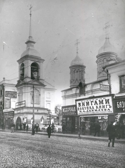
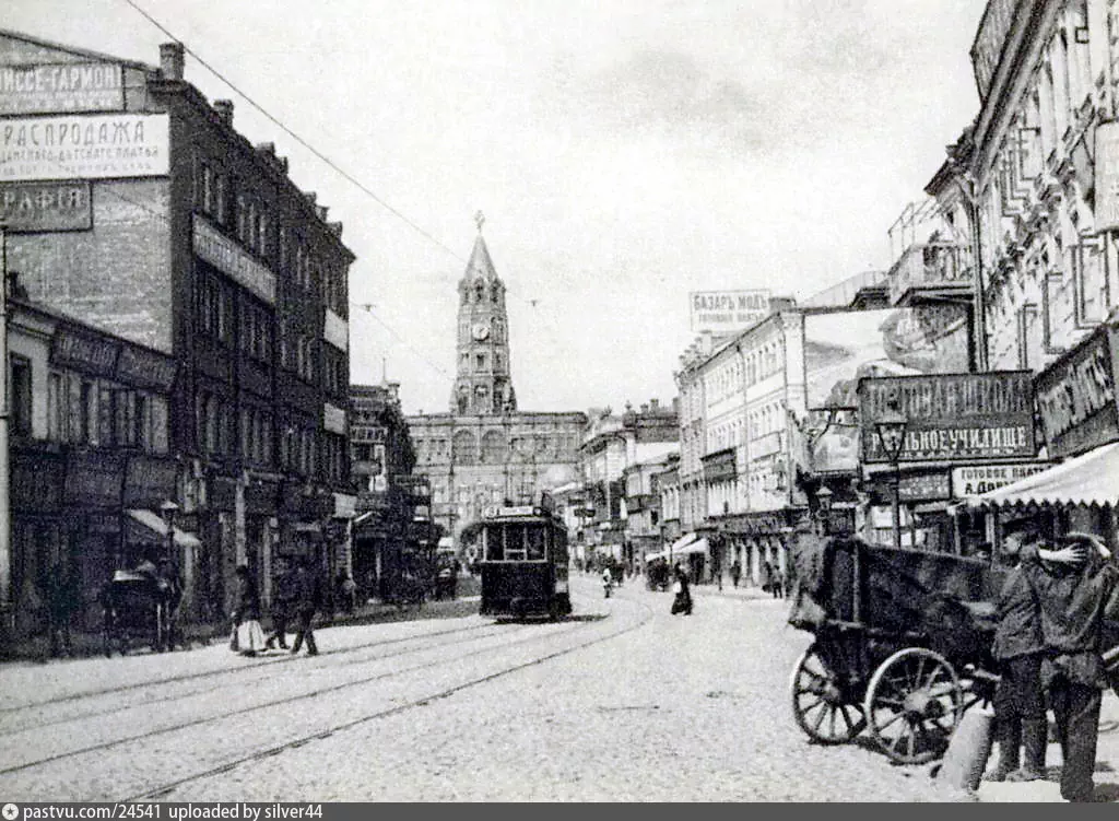

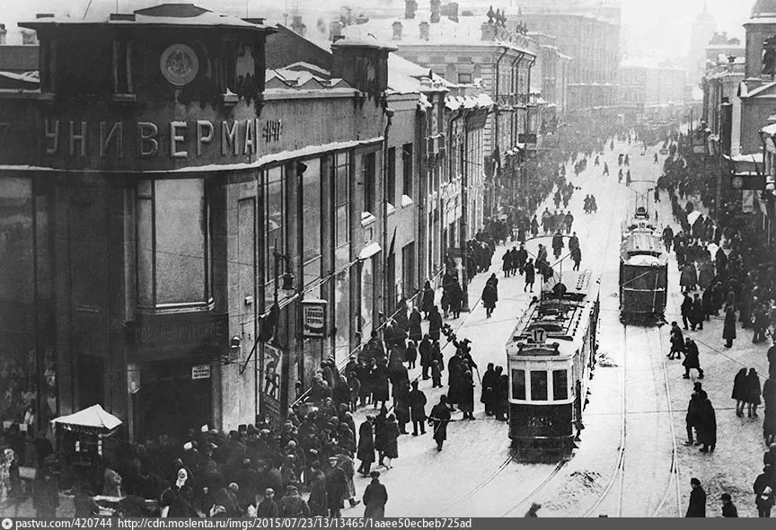

Three hundred years of reputation no developer could buy.
The architects’ project description became my branding brief: a confident, modern building in a place where history does the talking.
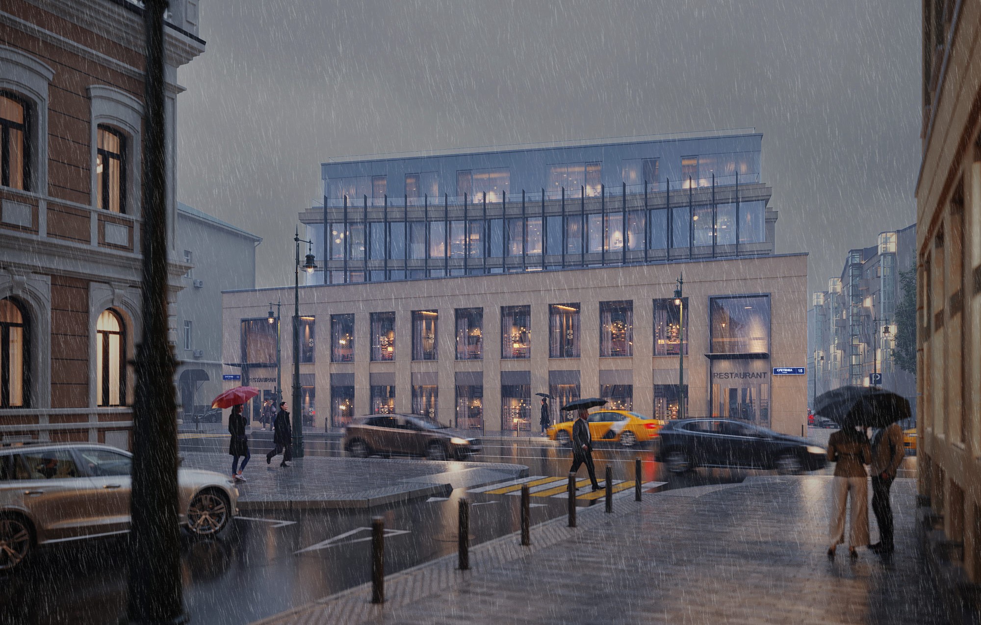
VIS ON visualization. Evening View from Sretenka St.
The Challenge
How do you brand a building whose best asset is its address?
Sretenka needs no introduction. An address locates you; it doesn’t set you apart.
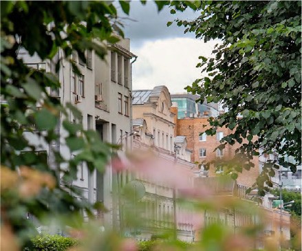

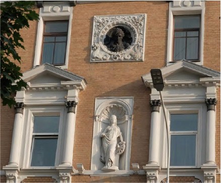
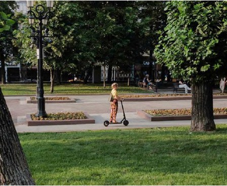
Around Sretenka
Photo: ??
How the neighbors talk about themselves
The center in all respects
Europe inside the Garden Ring
A mansion with history in the heart of Moscow
In the heart of variety
A club house in the very heart of the capital
Every building in the neighborhood says the same five things — luxury, historic center, thirty residences, concierge — and illustrates them the same way: a woman with a glass of wine by a tall window.
The raw material here was richer than most, John McAslan + Partners and three centuries of street. It would have been used the same way.
Insight
They love old Moscow. They won’t live in it.
The low-rise lanes, the quiet, the history — and modern floor plans, light, and service.
This building is for people who know Prosvirin, Pushkarev, and Pechatnikov lanes by heart. They cherish the intimacy of the historic streets fifteen minutes from the Kremlin — and they won’t move into a 19th-century building: small windows, awkward floor plans, no service. They’ve seen the world and expect it to show at home.
One tension: old Moscow, without the compromises.
Naming
Everyone reaches for a bigger name.
This one is a house number.
The architects wrote “sympathetic scale to Sretenka” into the brief and built it. The name does the same — and it takes more nerve than Turgenev.
The category competes on who sounds grander. Against that, saying the house number out loud is not modesty; it’s the confident move, and the one premium London makes — 190 Strand, Holland Park Villas. Sretenka means to a Muscovite what Park Avenue means to a New Yorker. The logo carries the street’s name and number and nothing else.
That answers the old-Moscow half of the brief. For the other half, the city has its own tradition: buildings named by the people for one distinguishing feature — The House on the Embankment, The House on Legs, The Openwork House. None of those names was official. The goal was to join that tradition: a phrase Muscovites would say without thinking, and everyone would know which house. The building had the feature: a 25-meter pool.
The House with a Pool.
One tactic to make it stick: all communication seeded the longer form — The House with a Pool and a Garden — so the city would shorten it itself, and feel it had coined it.
Brand promise
Modern architecture and impeccable finishes on the most pleasant street in central Moscow.
One feature people will talk about — and that's where you live: in the House with a Pool.
Visual Identity
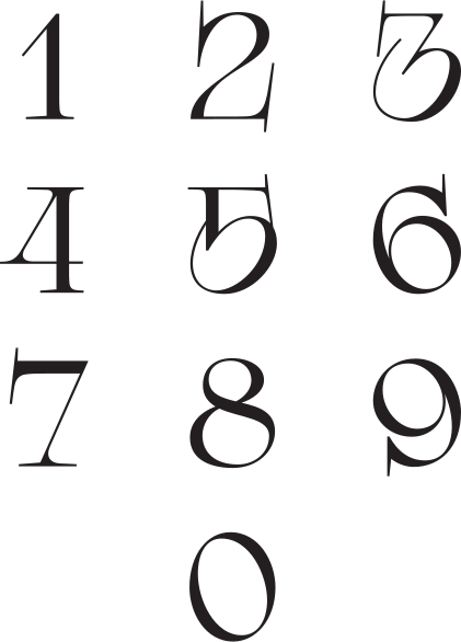
One idea, every surface: numerals distorted like light through water
From the logo to the pattern to the apartment doors — the same optical play, so nothing on the street looks like it.
Text
Mark
Typeface
Typeface connecting Sretenka timeline to font development times. They're practically the same age.


One feature people will talk about — and that's where you live: in the House with a Pool.
Color Palette
Every shade of greenhouse green. Print stock is never bleached white — slightly grayish, like unpainted wood.
34AADC
Aqua
F35834
Coral
Pattern
Works across scales — from book endpapers to wallpaper in the sales office.
In use
Works across scales — from book endpapers to wallpaper in the sales office.


Digits for apartment numbers
To maintain the stylistic unity, the numbers of the apartments are made with the same numbers used in the logo.

Art Direction
Water, as the 20th century painted it
One line, one subject: the photo brief was built entirely on the pool.
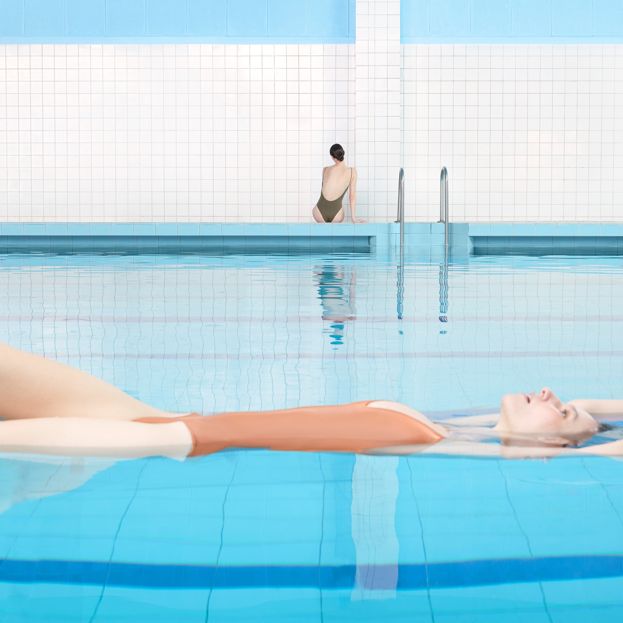
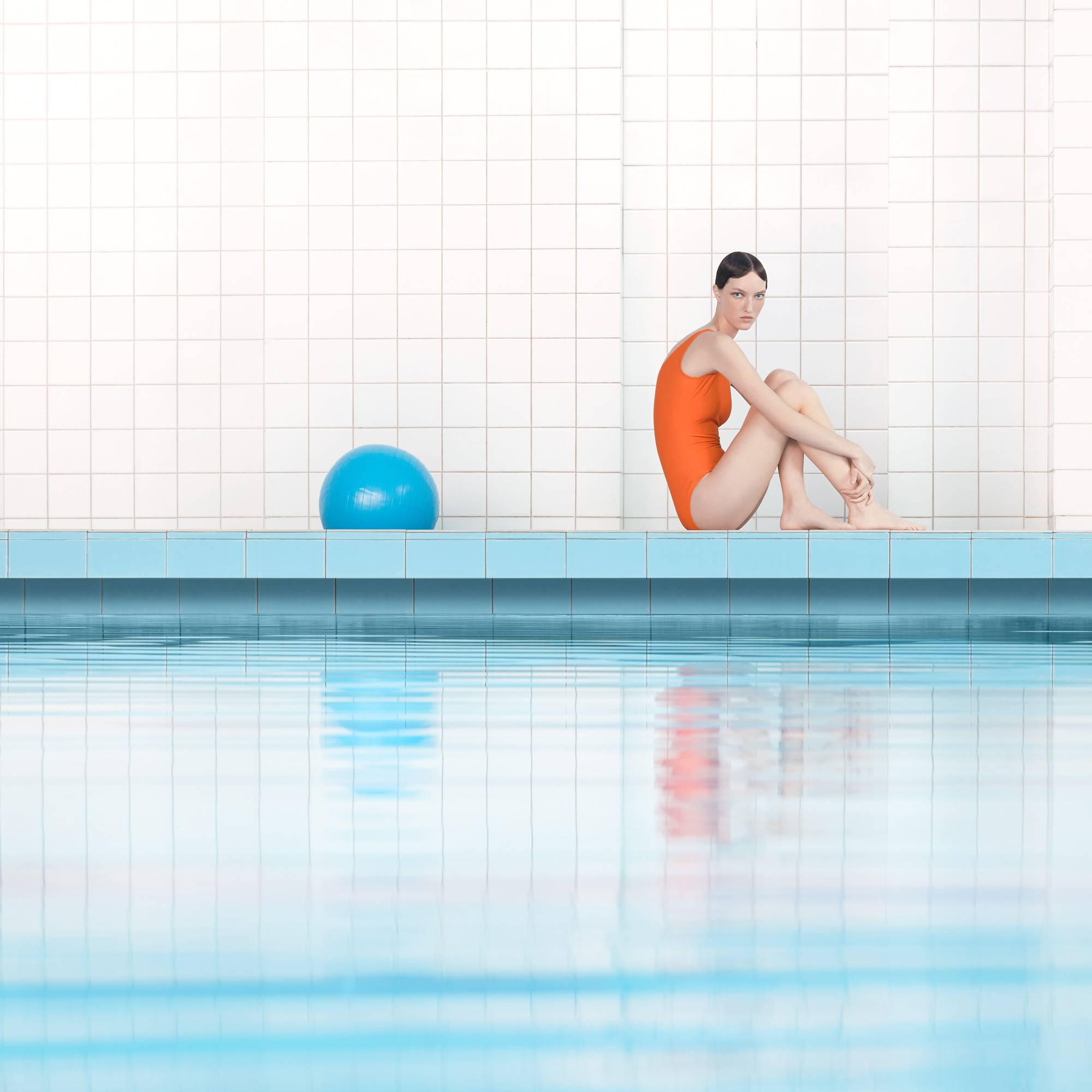
Because the strategy had a subject, the campaign needed one asset type: a photo set strong enough to carry the whole brand. The brief to the photographer: images that recall 20th-century painting and graphic art — calibrated light and shadow, reflections on the water’s surface, overhead and side angles. Everything that removes the feeling of an “everyday” photograph.
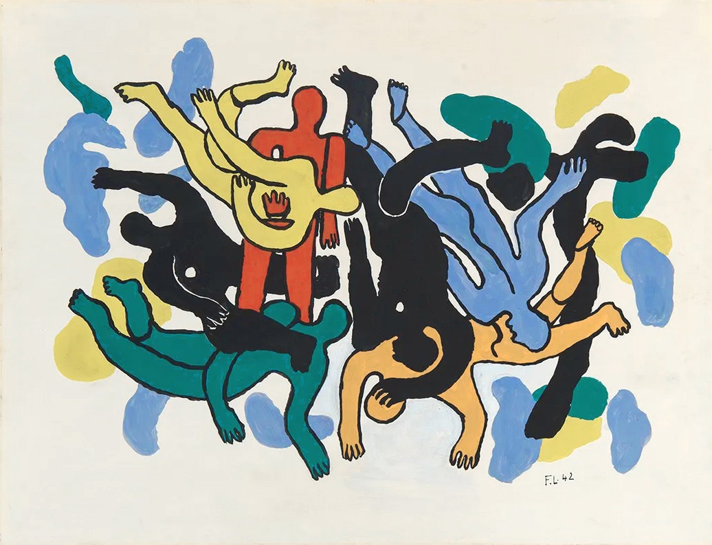
Fernand Léger, Les plongeurs, 1942
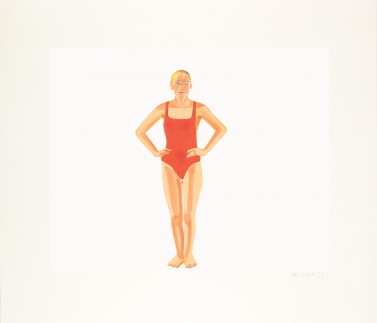
Alex Katz, Swimmer, 1990

Hockney, The Diver, 1972
Photoset
Water, as identity
Photographer: Yan Yugay
These images are the first contact anyone has with the brand. They’re addressed to people with an educated eye — who recognize the references and appreciate the restraint.





Tone of Voice
Restraint is the luxury
No “best,” “unique,” “revolutionary.” The category shouts; this house doesn’t need to.

Because the strategy had a subject, the campaign needed one asset type: a photo set strong enough to carry the whole brand.
Brevity
Concise, informative, confident without arrogance.
Restraint
No superlatives. Capture the essence.
Personal
Every line addressed to a person, not a segment.
Respect
No clichés. Suggest, don’t dictate.
Aesthetics
Rich but light language — visual and figurative.
What survived
The brand outlived the business plan
The project has changed course more than once since 2020. The positioning, the photography, and the identity didn’t.
The project’s strategy has shifted — from sales toward long-term leasing. Yan Yugay’s pool photographs are on the construction hoarding today, and “The House with a Pool” is on the holding page that says “coming soon.”
A brand built on a feature of the building, rather than on a marketing plan, had nothing to change when the plan did.
Reflection
What this project taught me
The discipline of subtraction: when a place already carries three centuries of reputation and the architecture is already quiet, the brand’s job is not to add — it’s to focus. One inherited name, one distinguishing feature, one photographic idea.
Looking back, I would have pushed for signage and interior graphics throughout the building — the water numerals wanted to live on every floor, not just the front doors.
Next case
New Academics →