Case study — Brand strategy · Identity · Naming · Creative direction · 2020
Sretenka 13/26
How one line set the whole communication strategy.
Architecture by John McAslan + Partners, London.

My role
Brand strategy, naming, visual identity, tone of voice, creative and art direction of photography and 3D visualization.
Scope
Positioning → naming → identity system → photo campaign → collateral → communication guidelines.
What's there
A quiet building on a loud street
Sretenka is a street Muscovites love. The housing on it is old.
Think of it as the West Village or Beacon Hill — an iconic, historic neighborhood where new construction is rare, and aggressive luxury branding looks cheap and out of place.
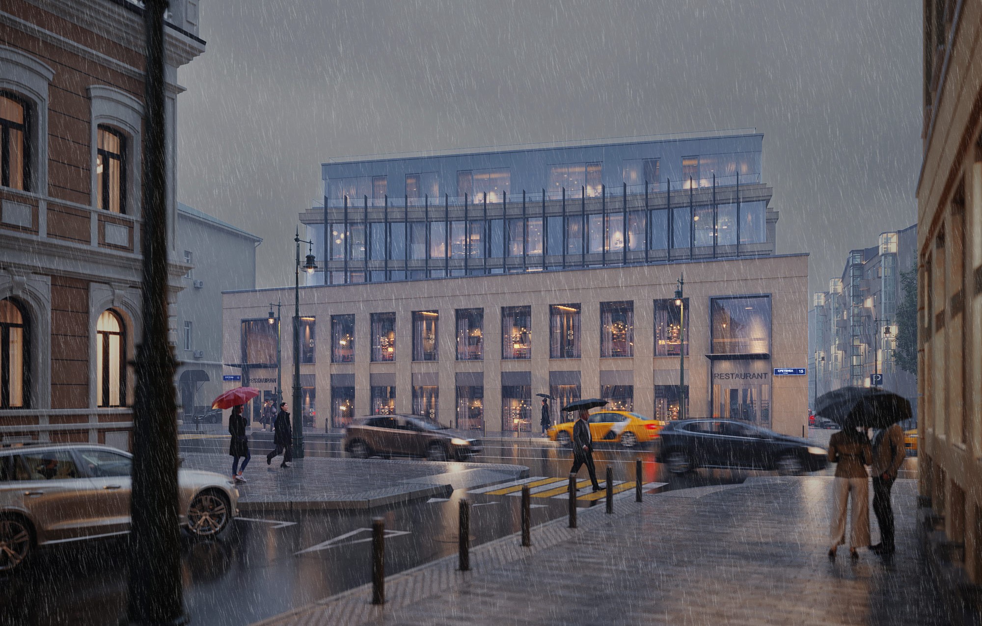
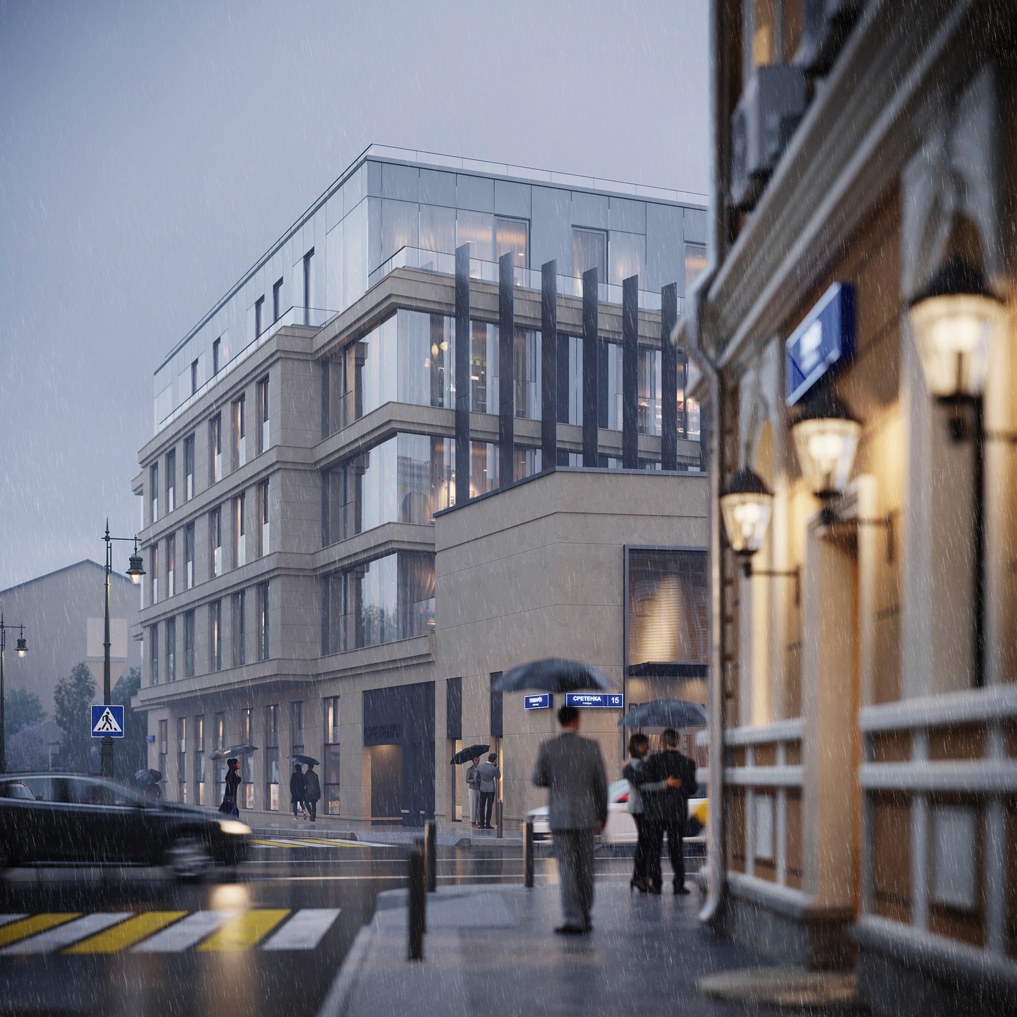
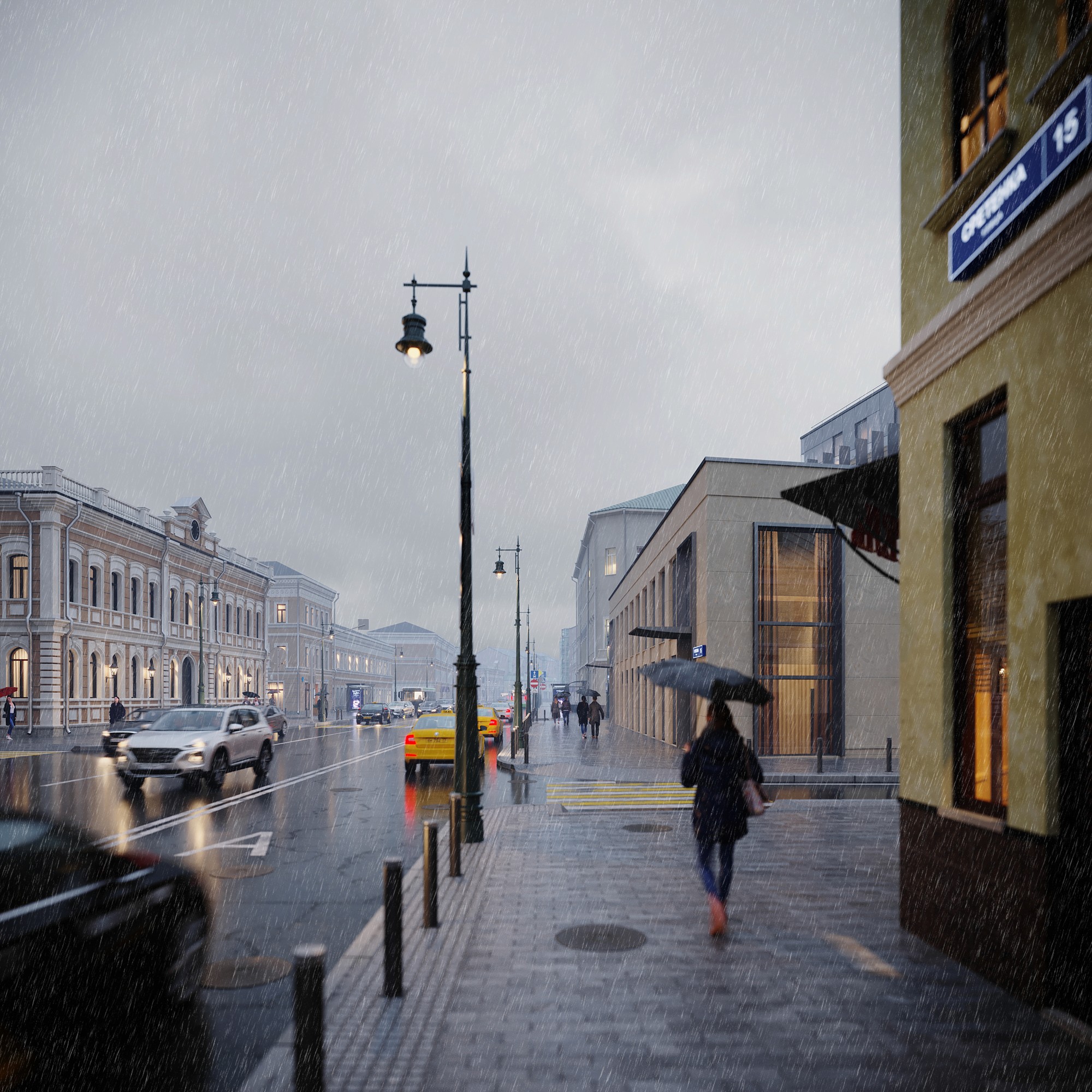
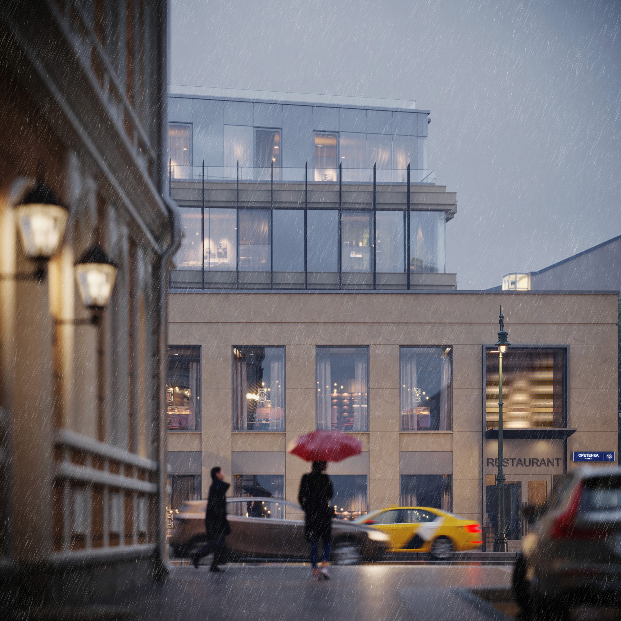
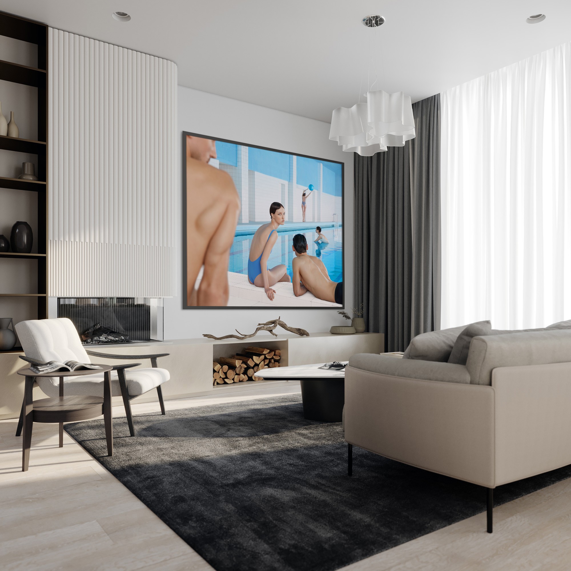
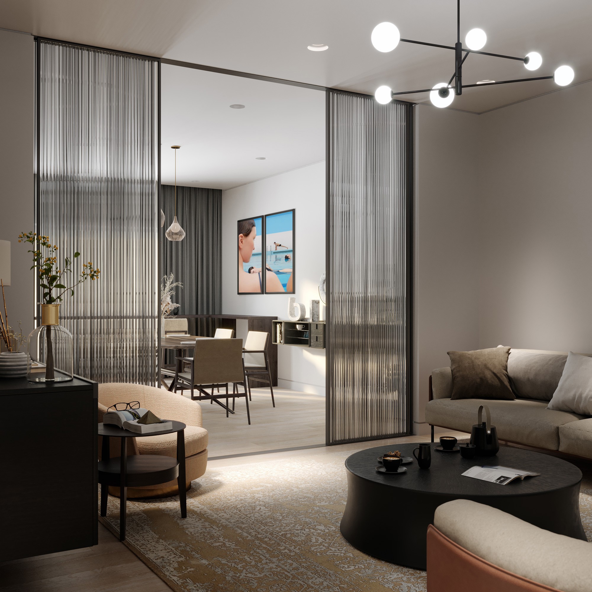
VIS ON visualization.
A modern building by British architects, deliberately quiet: it doesn't compete with the historic street. The architecture had already set the tone.
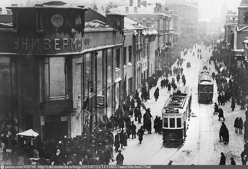
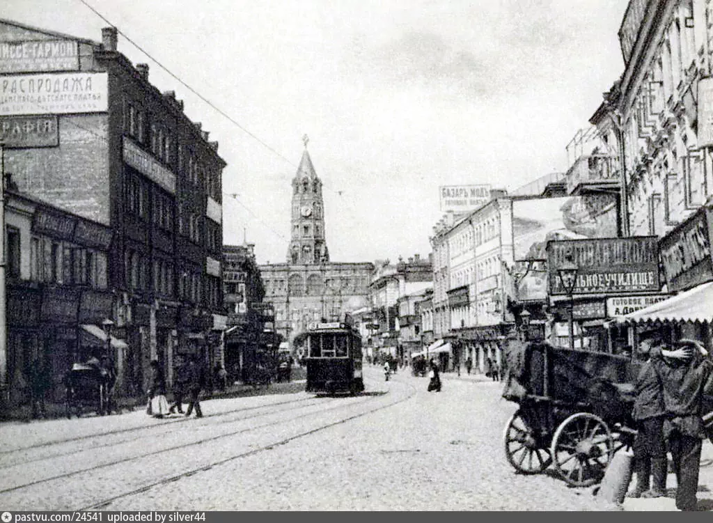

Three hundred years of reputation no developer could buy.
The Challenge
How do you brand a building whose best asset is its address?
An address locates you. It doesn't set you apart.
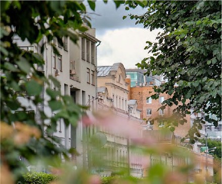

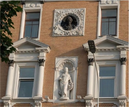
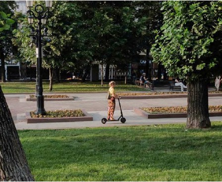
Around Sretenka. Photo: Anna Antonova
How the neighbors solve this
Every building in the neighborhood says the same four things — luxury, historic center, thirty residences, concierge. Tell the luxury story, invent a grand name:
Turgenev — The center in all respects
Tsvet 32 — Europe inside the Garden Ring
La Rue — A mansion with history in the heart of Moscow
Manor — A club house of 7 apartments in the very heart of the capital
Red-7 — Exceptional. On the Garden Ring.
A new building on Sretenka is an event on its own. No need to shout.
What we did
The house number is enough for a name. Not for a story.
Officially: Sretenka 13/26. Understated, architectural, self-sufficient.
But an address only tells people where you are. It doesn’t give them a reason to talk. So what do I build the communication on?
The building had one thing the street didn't: a 25-meter pool in the historic core. Instead of hiding it in an amenity list, I put it in the name:
House with a Pool.
Why
One line, two jobs
It looks like a USP. It's more than that.
Moscow names its houses by what sets them apart — The Flat House, The House on the Embankment, The House on Legs — and none of those names was official.
The goal was that kind of name: one that fits into speech, that people would use without thinking, that the city would take as its own. To help it along, every piece of communication said "The House with a Pool and a Garden," so people would shorten it themselves.

The Flat House

The House on the Embankment

The House on Legs
For the buyer, the line puts the strongest feature first. For me, it says exactly what to build the visual communication on.
Together, the two were meant to earn the building a premium over the street.
Art Direction
Water, as the artists painted it
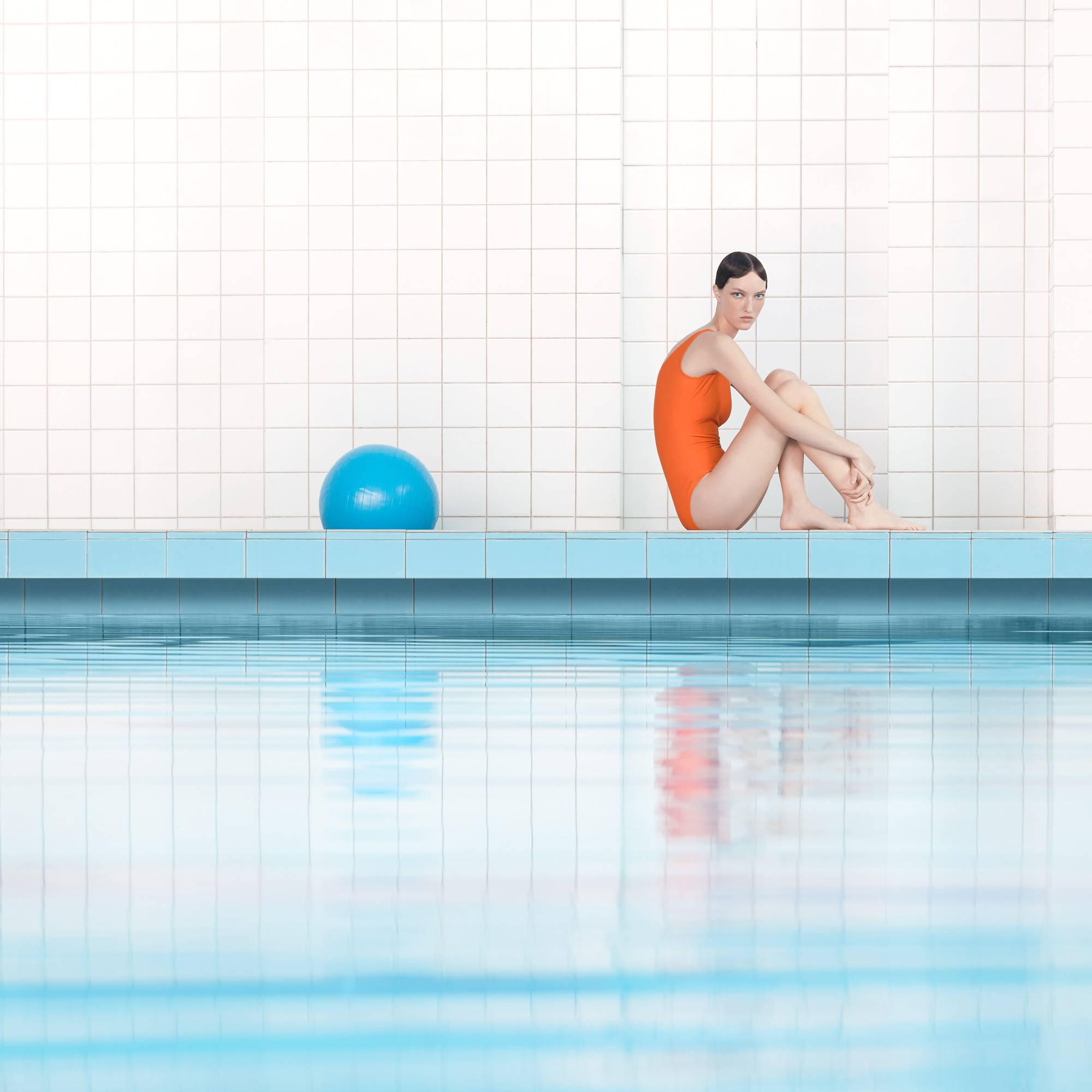
One line, one subject: the photo brief was built entirely on the pool.
Because the strategy had a subject, the campaign needed one asset type: a photo set strong enough to carry the whole brand. The brief to the photographer: images that recall 20th-century painting and graphic art — calibrated light and shadow, reflections on the water’s surface, overhead and side angles. Everything that removes the feeling of an “everyday” photograph.
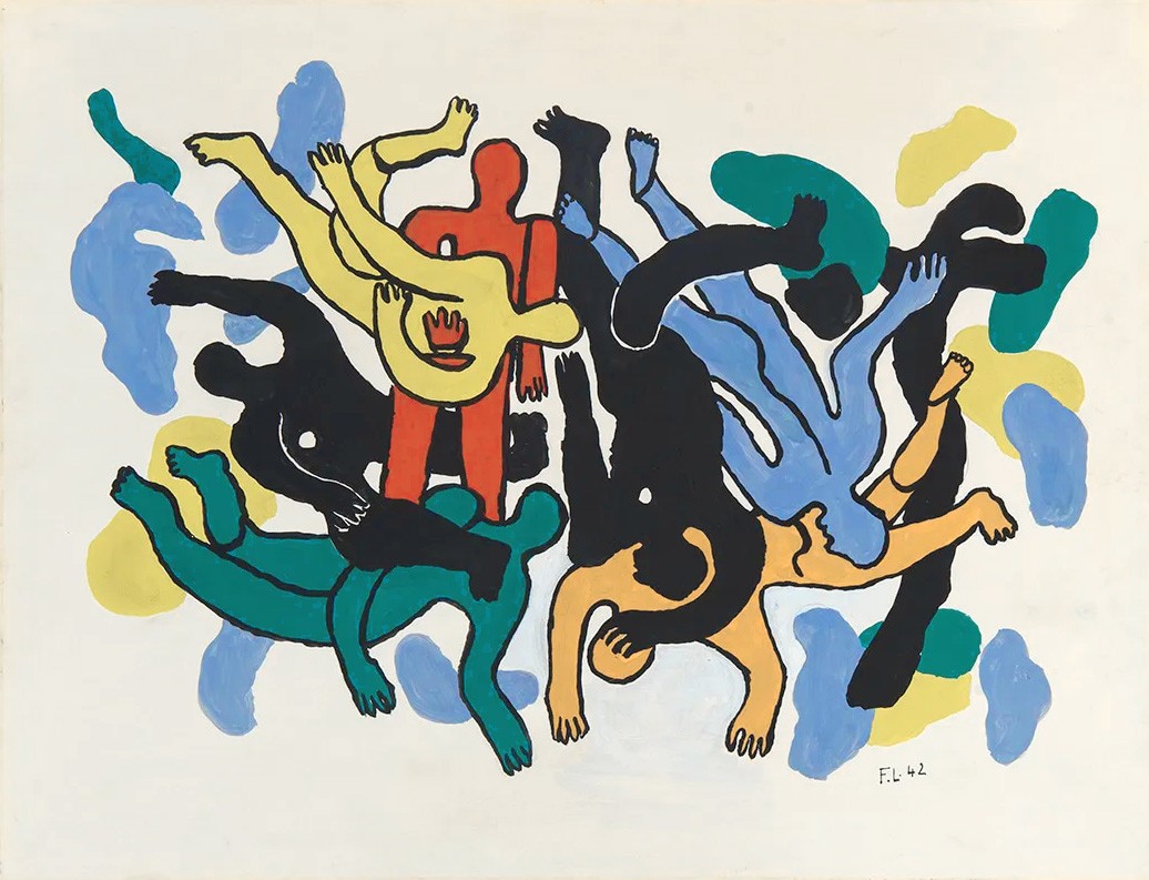
Fernand Léger, Les plongeurs, 1942
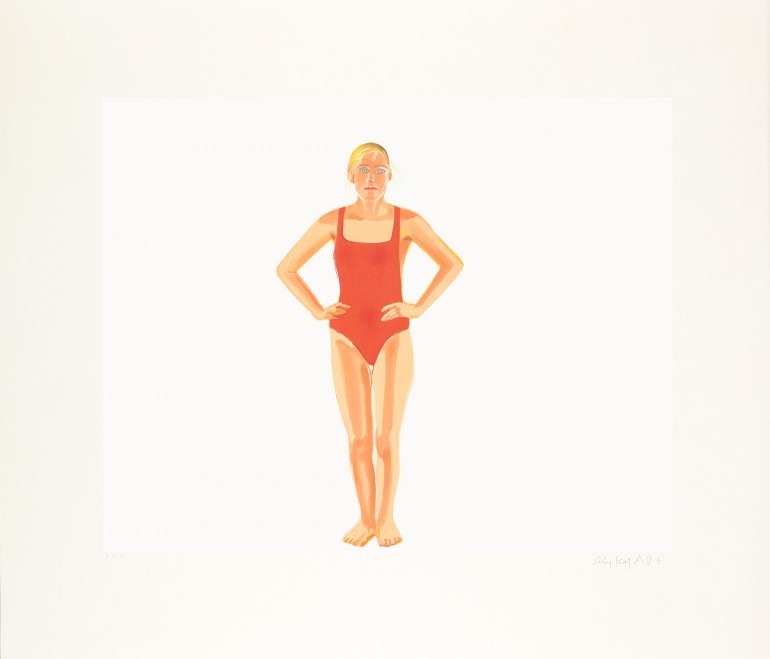
Alex Katz, Swimmer, 1990

David Hockney, The Diver, 1972
Photo set
The Pool, as identity
These images are the first contact anyone has with the brand. They’re addressed to people with an educated eye — who recognize the references and appreciate the restraint.
Credit: LI–NE agency, photographer Yan Yugay.


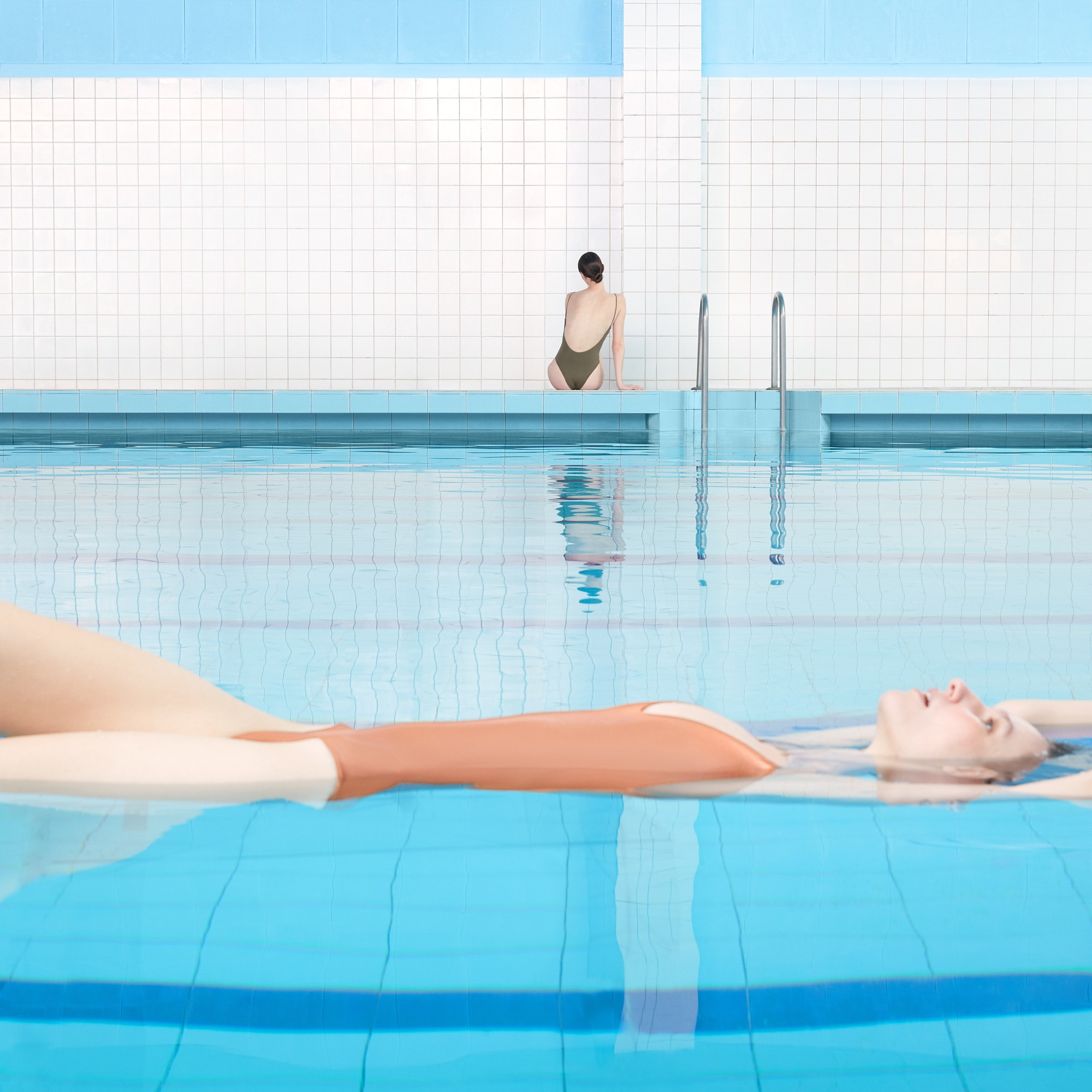



Visual Identity
The photographs set the rule; the identity follows it
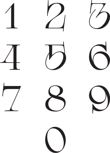
From the logo to the pattern to the apartment doors — the same optical play, so nothing on the street looks like it.
Logo
The numerals bend the way a pool floor does under moving water.
Typeface
With its balanced, low-key elegance, Garamond feels like the typographical twin of Sretenka—fitting, given they’re both 16th-century.


One feature people will talk about — and that's where you live: in the House with a Pool.
Color Palette
Water blues on near-white, ink for text, one warm accent — like sunlight on skin.
34AADC
Aqua
F35834
Coral
Pattern
A small pool in your hands.
In use
Envelope, cards, letterhead, notebook, door numbers — the same numerals and the same water everywhere.

The envelope window is a small pool. The swimmer is already in it.


Digits for apartment numbers
The logo's numerals, on every door.

Tone of Voice
Restraint is the luxury
The category sells with "unique," "exclusive," "the best."
Here the rule is the opposite: say less, and say it to a person.
Brevity
Concise, informative, confident without arrogance.
Restraint
No superlatives. Capture the essence.
Personal
Every line addressed to a person, not a segment.
Respect
No clichés. Suggest, don’t dictate.
Aesthetics
Rich but light language — visual and figurative.
What survived
The brand outlived the business plan
Since 2020 the project has moved from sales to long-term leasing.
Completed in 2026, it is now preparing for its opening.
Most real estate branding breaks when the model changes. This one didn’t move. The imagery, the tone of voice, and The House with a Pool work under the new format.
The strategy didn't need to change.


Reflection
What this project taught me
Take the message from the product. Not from outside it — a writer's name, a metaphor about Europe in Moscow, a lifestyle borrowed from a stock photo. The building had a pool, that was enough.
And look for the place where people can carry the name themselves. The "and a Garden" tactic was one such place. Next time I'll look for it first.
Credits
Architecture
John McAslan + Partners
KAMEN (architect of record)
Renderings
VIS ON
Photography
Yan Yugay
LI-NE Agency
Next case
New Academics →