Case study — Brand strategy · Identity · Naming · Creative direction · 2023—2024
New Academics
Brand for a premium residential development in Moscow’s Academic district, near Moscow State University.
Architecture by UNStudio.




My role
Brand strategy, naming, visual identity, art direction, creative direction of the launch campaign.
Scope
Research → positioning → naming → identity system → brand book → campaign → website.
Result
46 units (about 6% of the building) under contract in the first 48 hours. Sold without a single interior image.
Selected Recognition
WDA — Gold, Real Estate
CSSDA — Website of the Day
WOW Awards 2024 — Book

PART ONE
Context
A new home in Moscow’s most intellectual neighborhood
UNStudio architecture, terraced greenhouses, and a district where generations of scientists grew up.
A new residential development was planned for one of Moscow’s most storied neighborhoods — the Academic district near Moscow State University, home to generations of scientists and professors.


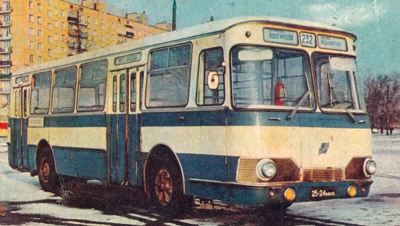
The district in the 1960s–70s: archive photographs.
UNStudio’s architecture connected modern towers with terraced greenhouses, red brick, and a shared courtyard, echoing the district’s intellectual heritage.
The developer needed a brand that would do the same: honor the place, and sell a new way of living in it.
The Challenge
The people this place was made for couldn’t afford it
The brand had to attract premium buyers — without betraying the district’s intellectual character.

Premium residential brands in Moscow competed on the same promises: location, status, square meters. This project had something rarer — a genuine connection to place — but also a real positioning problem: the neighborhood’s natural audience, academics and researchers, couldn’t afford it.
There was a second problem, and I'll come back to it in Chapter 9.
Research
Looking for the insight that could connect product to people
And for the buyer who shares the values and has the means
The place
Streets named after scientists — and their grandchildren still living here. Leafy streets, minutes from downtown.
The product
Greenhouses, a preserved birch grove, red brick: the professor’s dacha, rebuilt in the middle of the city.
The audience
Not the professors — their successors. Tech founders and young scientists with an entrepreneurial streak: same values, considerably higher income.
What the research showed:
Their dreams are tied to the idea of country living. They’d gladly move into a spacious country house — many already own one.
But they won’t give up the city — its pace, its variety, the schools and the work — for themselves or for their kids.

A Dacha in the Fall

Grandpa's Old Apartment

Grandpa's Study

Grandpa's Dacha

Courtyard

Library in a Greenhouse

Tea Room in the Greenhouse

City Terraces

Soviet Dachas

Soviet Panel Buildings

Soviet public courtyard

Brand Idea
Conservatory living: the countryside brought inside the city walls
The product already held the answer.
UNStudio had put greenhouses on the terraces, glass over the lobby and a birch grove in the courtyard — the architecture was literally a conservatory.

A glassed-in dacha porch — the Russian summer cottage's conservatory.

The greenhouse atrium of the Soviet Academy of Sciences presidium, Moscow.

The old greenhouse of Moscow's Main Botanical Garden.
The strategy was to make that the whole brand: not a building with greenhouses, but a place where things grow. Plants, children, ideas, a second career. The professor's dacha, rebuilt in the middle of Moscow.

Part Two
Naming
The name shouldn’t describe the plants — it should describe the people
From “Botanica” and “Greenyard” to a name that tells you who your neighbors are.
I started with names drawn from the site’s botanical diversity and the architects’ attention to bird life: “Botanica”, “Birds & Cherry”, “Greenyard”, “Song Thrush”, “Forrest”. All true to the site — none true to the audience.
As the audience came into focus, the name had to describe the people we wanted to attract: who they are, and how they’re connected to this neighborhood.



That’s how the project became “New Academics” — scientists, founders, and creative professionals whom the internet has freed from dependence on institutions.
In Russian, it works as a place name: “I live in New Academics.”
Brand promise

You don’t have to choose between the dacha and the city.
Life surrounded by nature, safe and unhurried, with room for intellectual and creative pursuits. Success here isn’t about showing off — it’s the quiet pleasure of having both.
Visual identity
An identity that grows like a garden
Fixed core, endlessly flexible botanical arrangements — the system adapts to any format.
Typeface


Color Palette
Every shade of greenhouse green. Print stock is never bleached white — slightly grayish, like unpainted wood.
879484
Dusty Olive
F2F1EE
Parchment
F69341
Greenhouse Orange
2E4A5C
Charcoal Blue
Pattern
Works across scales — from book endpapers to wallpaper in the sales office.

Herbarium
Twenty plants that don't exist. They belong to a child who appears later in this story, so mood mattered more than botany: the blues and rusts of the palette, a little wonder. Generated in Midjourney, hand-edited into one set, each a separate numbered asset.





In use
Business cards, folders, letterheads, notebooks, merchandise. Strict rules about the frame, the logo and the type — and complete freedom inside them. Each employee puts together their own arrangement from the herbarium, so no two pieces in circulation are identical.


PART THREE
The decision
Sell a premium apartment without showing the apartment
This was the second problem. The apartments were sold as bare shells: there were no interiors to photograph, and there was never going to be a version of this brand that showed you a finished room.
All 784 units are being sold as bare shells — seven types, from a 377 sq ft one-bedroom to a 2,874 sq ft penthouse: one to four bedrooms, duplexes, double-height apartments, and no studios at all, because the building was designed for families.
Not one had a designed interior, because the interior was the buyer's to design.


That left the launch without the one thing buyers of a premium apartment expect to see first. But a render of a furnished living room would have been a picture of something nobody was selling — somebody else's taste in a room you'd then build yourself.
So the visualization budget went to the two things that prove the greenhouse idea at human scale: the forest courtyard with its birch grove and birds, and the terraces under glass. The rooms went to a story instead — one that puts you inside them with your own furniture, which is exactly what you were buying.
Everything that follows came out of that trade.
The Characters
Meet Vasily and Vasilisa — a couple secretly house-hunting behind each other’s backs
One family instead of interiors — cast, styled and photographed as specific people rather than stock residents.

Vasily is an architect restoring a red-brick water tower. He grew up at his father’s dacha, where an MSU professor gathered guests for summer evenings of music and arguments about books.

Vasilisa paints on commission for galleries and throws pots — whenever there is room for the wheel.
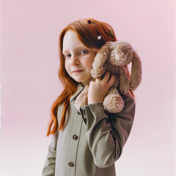
Their daughter, Vesnushka (“Freckle”), keeps a herbarium — a pressed-plant collection — big enough for an exhibition, currently packed in boxes at the top of a closet.
What finally forces the move is furniture: a mahogany drafting table wedged between the bed and the window, a pottery wheel disguised as a kitchen table.
Both of them start looking in secret, in opposite directions — he searches for an apartment downtown, she searches for a house outside the city. The grandmother, who has spent her whole life in the Academic district, quietly sends the same link to everyone. The family arrives at the sales office by accident, all at once, and the daughter has already found the scale model of the courtyard.
Book
The book took the same family and gave them neighbors
Part novel, part brand manifesto, part spec sheet — and the production hub of the whole launch
Anna researches forgotten regional recipes and launches her cookbook downstairs. Her son Anton becomes Vesnushka’s first friend in the yard. Lera, an upcycling sculptor, works in the two-story loft above. Each chapter hands one part of the building to one of them.


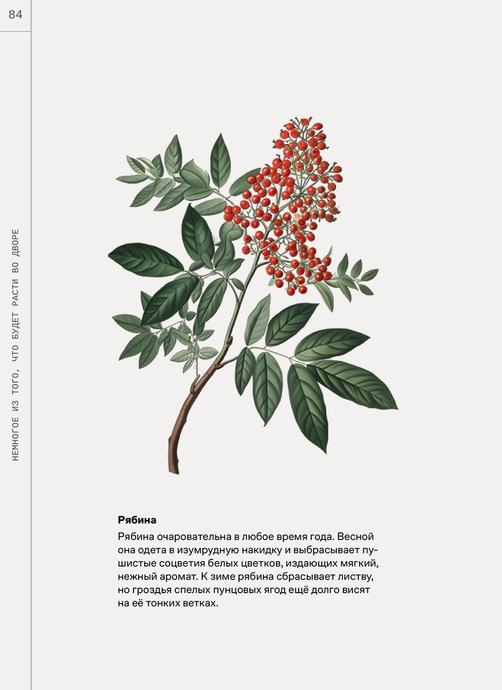


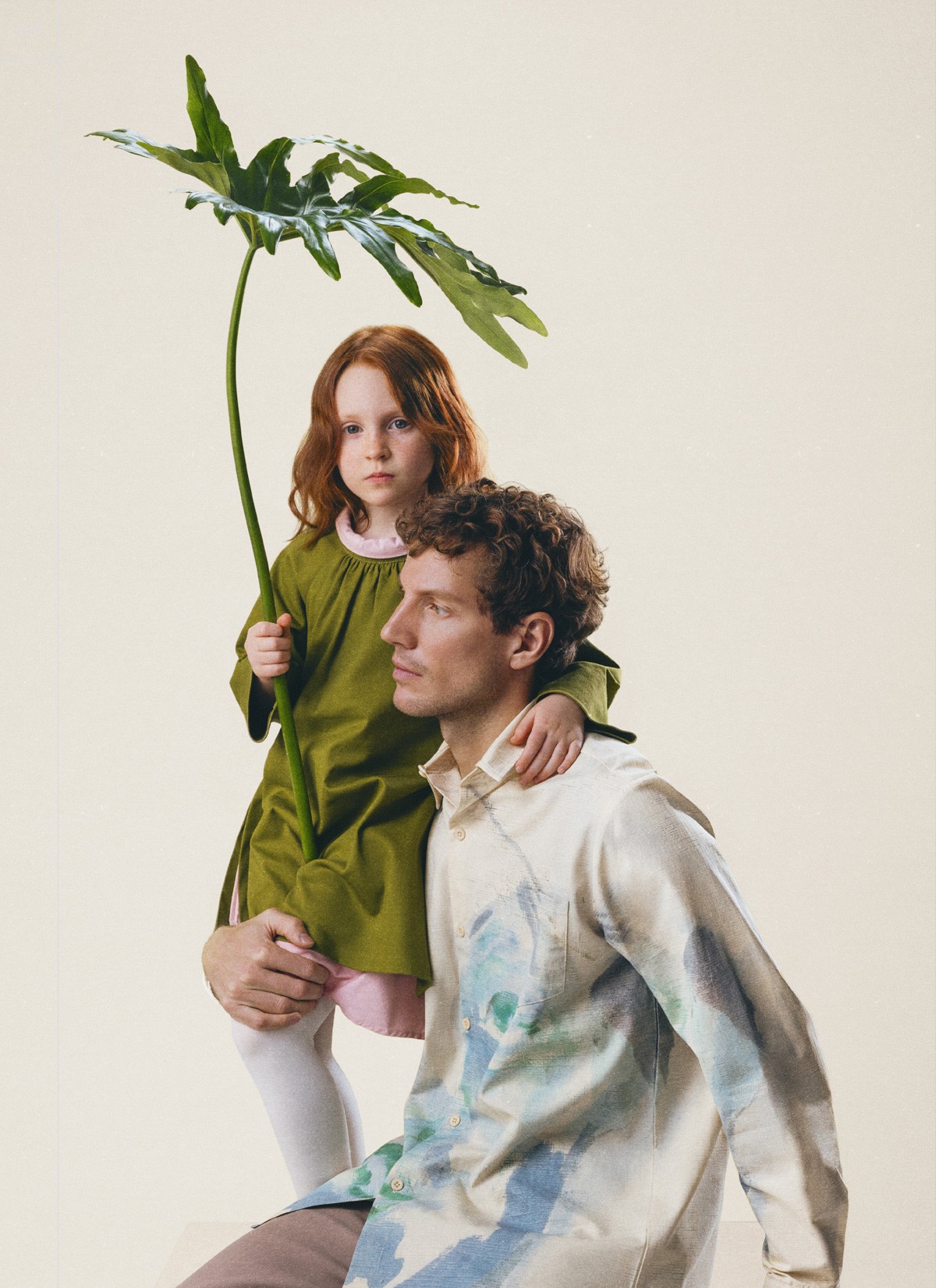
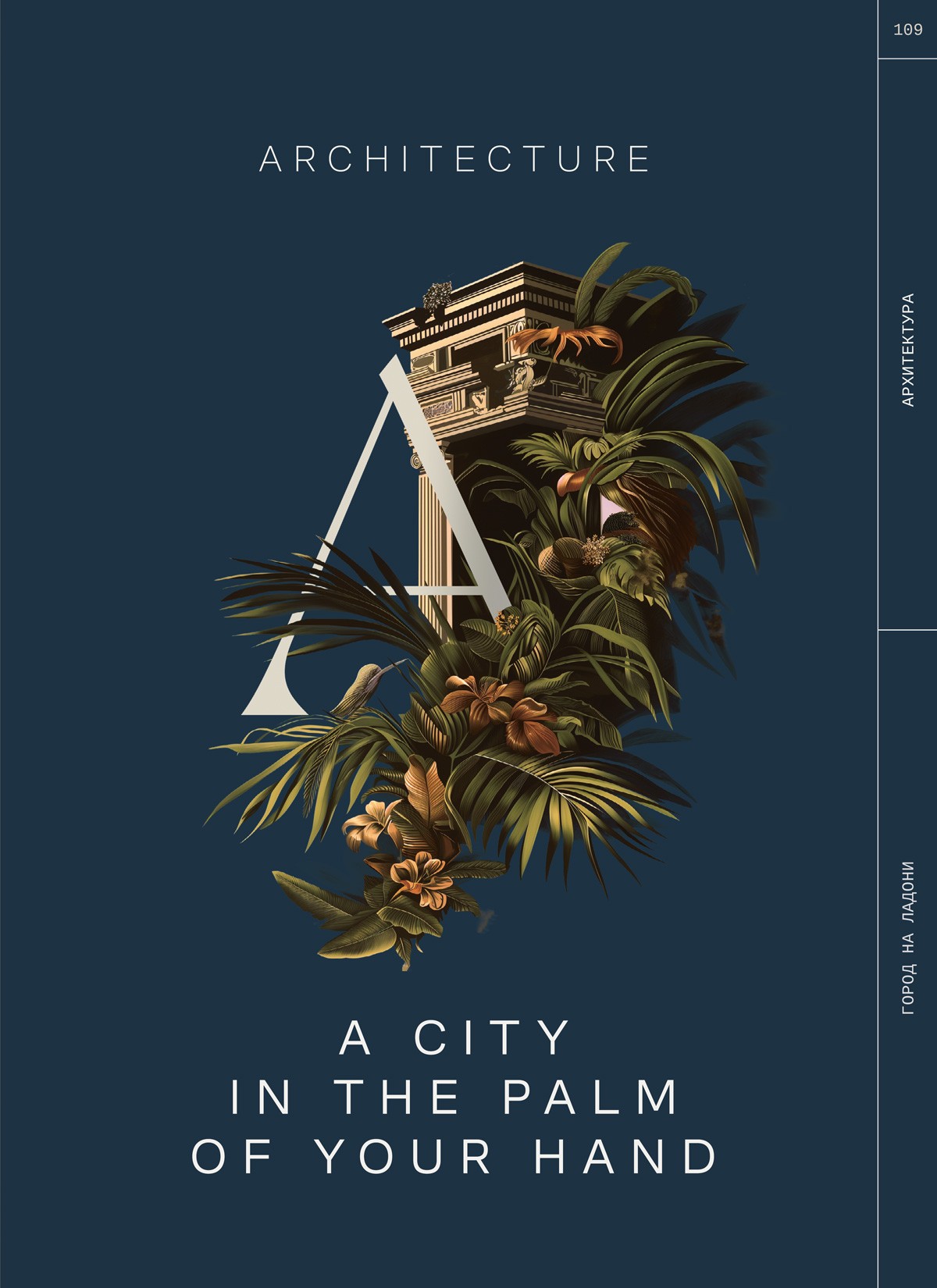


Between the stories sit the specification spreads — floor plans, planting lists, window and balcony details, UNStudio’s earlier buildings. The reader moves between the two at will: fiction to be persuaded by, facts to verify it against. No feature is listed on its own; each shows up as a moment in somebody’s life.
Making the book made the launch. To finish it we had to draw the floor plans, cast and shoot the family, direct the illustrations and write finished copy for every part of the building — all of which went straight into the website, the advertising and the sales office.
Photoset
People, not renderings
A magazine-style shoot built the brand’s image library — buyers recognize themselves, not square footage. Photography: Masha Demianova


Website
A site you read, not a site you filter
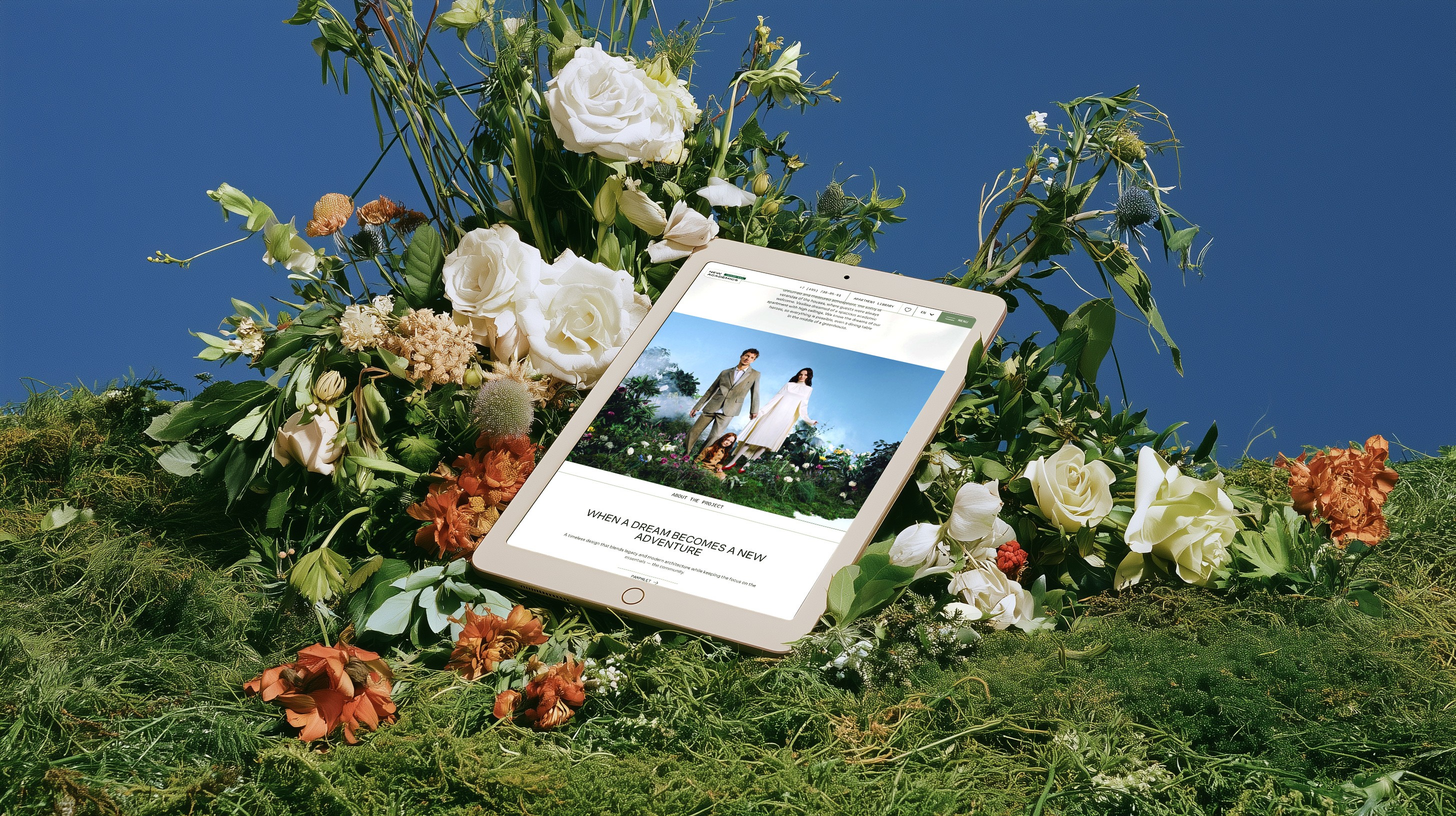
Stories interleaved with facts — built by ONLY, a Moscow digital studio, on the finished brand platform.
I briefed ONLY as the brand lead: the strategy, the characters and the creative frame for the stories were in place, and the book's text was still being written. The studio's best idea was theirs — presenting the family as Instagram-style stories, so the characters feel alive on the site rather than pasted in. From there I acted as the client-side creative lead: reviewing every design round directly with their designer and art director, and working through the apartment library and booking flow together.
Launch
46 contracts in the first two days
The launch event opened sales for a building that still had no interiors to show.
46 apartments (about 6% of the building) went under contract in the first two days of sales. The sales office opened with the book on the table, the pattern on the walls and the family on the screens — the same story buyers had already met online, now in a room they could walk into.


Reflection
What this project taught me
The strongest positioning often hides inside a conflict. Here it was between a country-house dream and an urban life; once the brand resolved that tension, the name, the story and the visuals followed from it.
The second lesson was matching the method to the product. Bare shells took away every rule of premium real-estate marketing — lead with the interior, dress the room — so the whole visualization budget went to one idea, and the stories did the rooms.
Next time I'd bring the writer, the photographer and the web studio in right after strategy, not after identity. Harder to hold together; worth it.
Branding entered this project on the cost line and behaved like an investment.

Credits
Architecture
UNStudio
Apex (architect of record)
Renderings
Oak3d
Marta Pictures
Zoa3d
Illustrations
UNStudio
Eric Samigkulov
Polina Chebotar
Evgeny Tsoy
Photography
Masha Demianova
Writer
Sasha Stepanova
Website
ONLY
Next Project: