Case study — Brand strategy · Identity · Naming · Creative direction · 2023—2024
Sojmonov
A brand built from one man's biography — for a heritage building on Sojmonovsky Proyezd, facing the Cathedral of Christ the Savior, converted into luxury residences.

My role
Brand strategy, research, product strategy, visual identity, art direction.
Scope
Research → positioning → product program → brand promise → identity system → campaign image.
Production
Campaign image, illustrations and the interactive 3D scene made solo, with Midjourney and Spline. No outside production team.
PART ONE
Context
The address was good enough to be the name
A 1902 landmark on one of the few streets where Moscow's century is visible from the window.
The building was carved into rental micro-offices through the Soviet decades. It is now being converted to luxury residences, with its landmark status intact.
It faces a spot that has been a cathedral, then an open-air swimming pool, then a cathedral again. The century played out in one line of sight.


The Moskva swimming pool on the cathedral's site, early 1960s.
Photo: Naum Granovsky.
And the list of assets is real: the cathedral visible from the living room — true of maybe five to seven residential addresses on this bank of the river; British architecture inside a protected shell; materials, service, privacy.
So the client's proposal made sense. Call it Sojmonovsky 7, or just 7. Draw a beautiful numeral and you have a brand.
Research
Then I looked up who the lane was named after
Mikhail Sojmonov. The house was his.
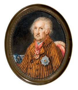
Mikhail Sojmonov, 1730—1804. A Russian statesman with a talent for turning expertise into institutions. Two of them are still open.
The mint
He ran the Empire's coinage for Catherine the Great and struck her copper rubles.
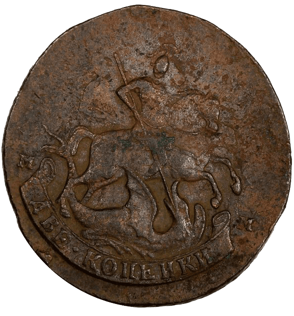
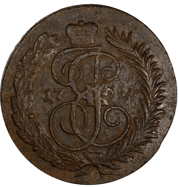
A copper ruble from the reign of Catherine the Great.
The mines
He organized Russian mining and sent out the first state ore-prospecting expeditions.
The school
In 1773 he founded the Mining School, where the country's technical education begins.
The museum
In 1773 he opened Russia's second public museum — at a time when the Hermitage was still a private collection.

The Mining Museum, St Petersburg — founded 1773.
The argument
He argued that mines run on wages would outproduce mines run on forced labor.
My Insight
That is not a name on a street sign.
That is a brief.
If the lane had been named after an ordinary senator, this would be a different case study. Research changed the brief.
The portrait also suggested a buyer: publicly active people, for whom the scarce resource is the circle, not the address.
Brand Idea
Closed on the outside. Open on the inside.
A conflict inside the product, and the club that resolved it.
A building at this level has to be closed — protocols, control, privacy. That same closedness isolates residents from one another, and removes exactly what this audience is short of.
The proposal: hard perimeter, open interior. A club, a bar and a program on the ground floor, open to residents and the guests they invite themselves. Not a client brief — a strategy I put forward.
The Club "Sojmonov"

The club on the ground floor — wine, food and art among neighbors you chose.

Lectures

Chamber concerts
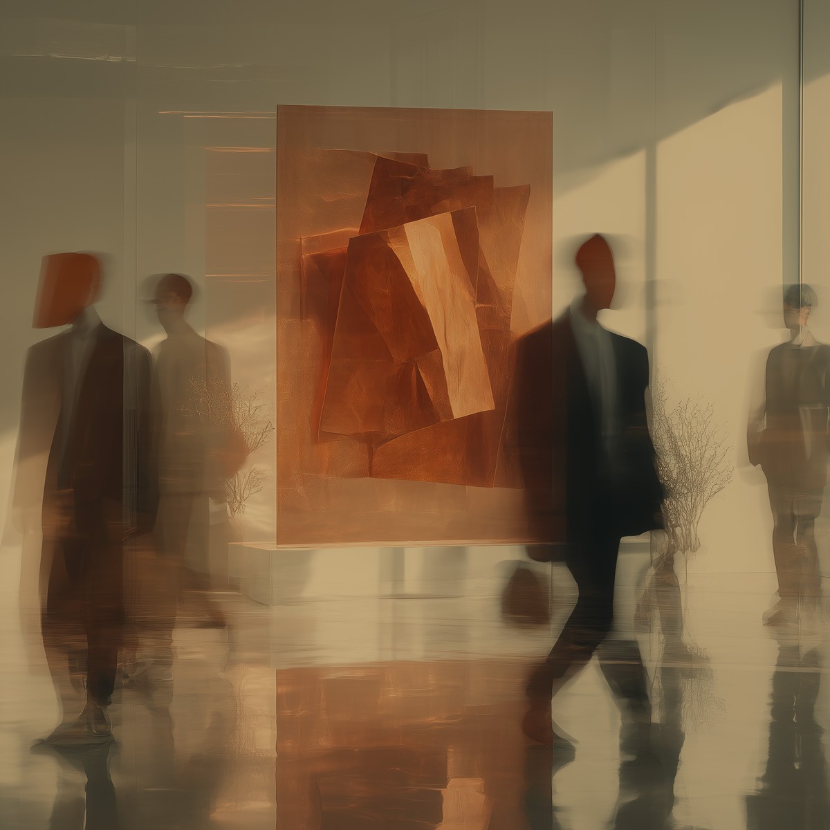
Art Auctions
The biography became the filter for product decisions. There were many ways to fill that interior. The ones I kept were the ones with a source in his life.
The founder of a public museum gives you a museum program.
The Programm

Night at the Museum
A resident's card for after-hours access to partner museums.

Exhibition previews
Curator-led, for residents and the people they bring.

Dinners and club nights
With artists and art historians, in the club.

Art on loan
A museum-grade work in the apartment, a month at a time.

Art advisor
Personal guidance for building a contemporary collection.
Brand promise
Social connections unavailable to anyone but you.
The perimeter is what makes the circle possible, not what replaces it.
Part Two
Visual identity
Copper, malachite, and a hidden 7
Every element traceable to something Sojmonov did.
The wordmark
The building number hides in the wordmark's negative space — in the Latin version, inside an italic J. Hidden on purpose. This audience looks.
The word
The brand word is the Russian nastoyashchee (настоящее). It carries the idea of the present and of what is real. One word connecting the two: real value, real art in the home, real connections, and a building that isn't living in its own past.
Typeface


Heraldry
The mark cites the Sojmonov family heraldry — a noble line traced to the 16th century.

Sojmonov's family coat of arms.
Color and material
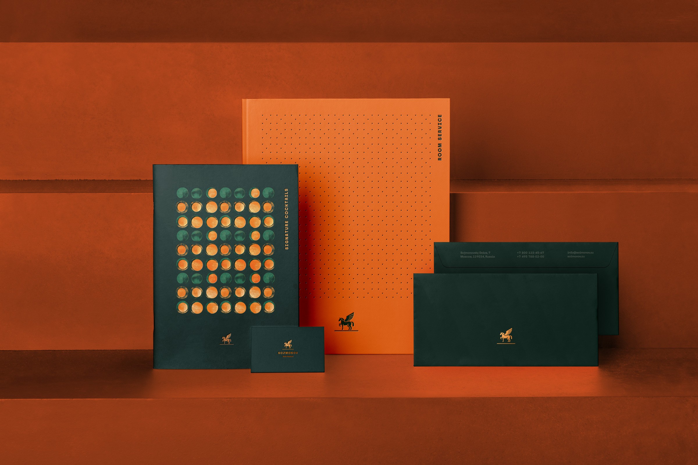
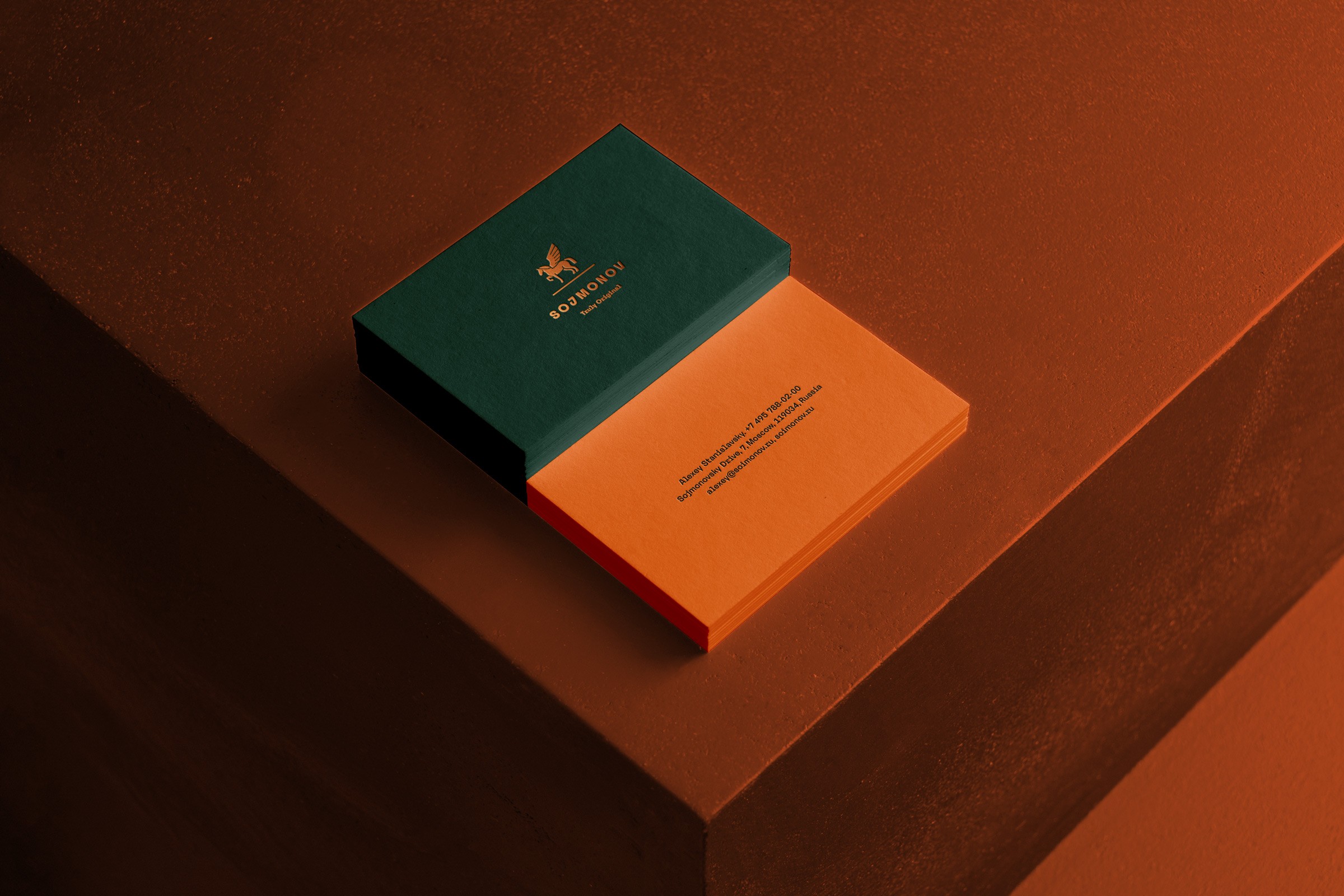
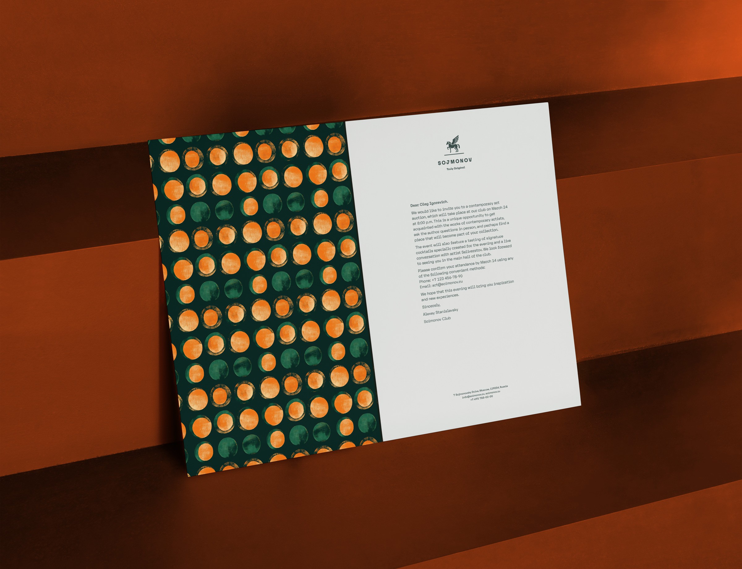
The palette comes from the biography rather than from a premium mood board: copper from the coins he minted, malachite from the Urals, the region he ran — a stone Russian folklore treats as precious in its own right.
1E5C4B
Malachite
A9672F
Copper
E37230
Orange
F4F2ED
Stone
Pattern
Copper coins and the Ural mines, abstracted into a surface that works from a business card to a wall.


The campaign image
Key Visual
The past built the brand. The present is where it lives.
Sojmonov's history gives the brand its foundation, but it was never meant to become its subject. His story can live in the booklets. The communication belongs to the present.
The people living here are brought together by art, pleasure, curiosity and the simple joy of being around interesting people. They have nothing to prove, and no reason to keep looking backwards.
So it was time to have some fun.
This is where the campaign image comes in: David blowing a bubble of gum, smart glasses reflecting the Cathedral of Christ the Savior, his fingers folded in a gesture borrowed from icon painting.
The image puts everything the brand has accumulated into the present tense: the cathedral and the pop culture, the sacred and the ridiculous, the history and the attitude.
Heritage, without nostalgia. Luxury, without solemnity.
Reflection
What this project taught me
Research. Research better and go deeper. It's worth it: a man who died in 1804 decided the positioning, the product, the palette and the campaign image of a building going to market two centuries later.
None of it invented. All of it read.
There are always more product ideas than a project needs.
What decides is not which idea is best, but which one has a source.
Credits
Brand
Eugene Kazakov
Imagery and 3D
Midjourney, Spline — by Eugene Kazakov
Archival photography
Branson DeCou (1931), Branson DeCou Archive, UC Santa Cruz.
Naum Granovsky (early 1960s).